 |
Download Now
Server 1Download Now
Server 2Download Now
Server 3
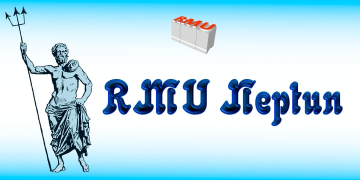
A turn-of-the-century Art Nouveau display font, originally from the Aktiengesellschaft fuer Schriftgiesserei und Maschinenbau, Offenbach, revived and extended.
 |
| RMU Neptun |
 |
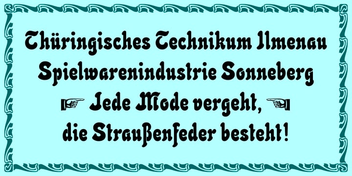
A turn-of-the-century Art Nouveau display font, originally from the Aktiengesellschaft fuer Schriftgiesserei und Maschinenbau, Offenbach, revived and extended.
 |
| RMU Neptun |
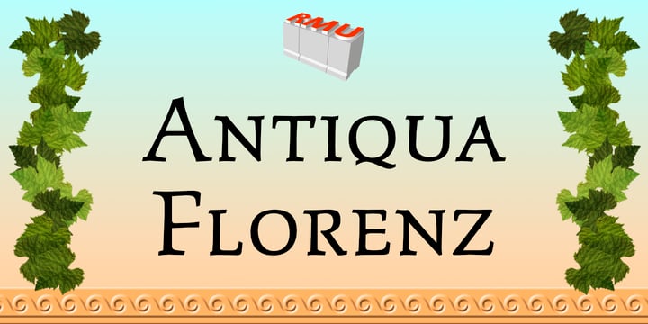 |
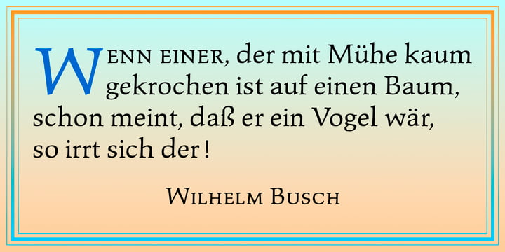
A font design of Paul Zimmermann, first released by Ludwig Wagner, Leipzig, in 1960, now revived and extended by Central European, Baltic, and Turkish character sets and their small caps. This font contains both lining and oldstyle numbers. To get access to all ligatures, it is recommended to activate both standard and discretionary ligatures.
 |
| Antiqua Florenz |
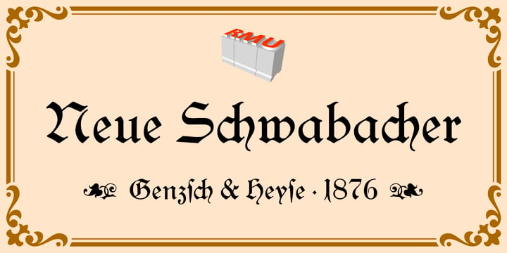 |
Neue Schwabacher is a revival of a revival. Albert Anklam modified the medieval letter forms of Schwabacher according to the fashion of the fin-de-siècle era, and his font was first released by Genzsch & Heyse in 1876.
This most widespread font face of the 19th century was fresh redrawn and made fit for nowadays’ usage.
To get access to all ligatures, it is recommended to activate both Standard and Discretionary ligatures.
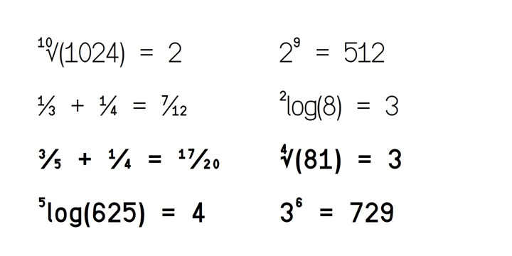 |
Font with more than 400 glyphs. This font can be used for the most comman languages and can als used for the basic calculus. Some glyphs for the fractions (and special rootfunction) there are used special characters (which be can used with the key code f0000 till f00014 (and Alt + X))
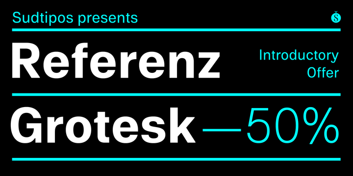 |
Made in Germany, Referenz Grotesk is a typeface full of references referring to the type design history of Stuttgart State Academy of Art and Design. Its typographic history holds a broad spectrum of shapes and characters, including F.H. Ernst Schneidler (1882–1956), Imre Reiner (1900–1987), Walter Brudi (1907–1987), Kurt Weidemann (1922–2011) and Frank Heine (1964–2003).
During extensive research phases for Referenz Grotesk included collection and analysis. This led to further research in the Academy’s collection and archive where the majority of Weidemann’s estate is housed next to works of other designers and professors like F.H. Ernst Schneidler and Walter Brudi. Another place of research was the typesetting workshop where Schneidler had previously taught and worked. Some of his freshly cast fonts were tested and used there for the first time and are still stored in several of the type cases. Regarding the more recent history, for instance about the Emigre designer Frank Heine, former colleagues and professors have been consulted.
These studies resulted in the new font Referenz Grotesk that includes traces of Kurt Weidemann’s Corporate as well as calligraphic hints that link to Schneidler’s Stuttgarter Schule (Stuttgart School) where writing played an important role during the form finding process. For the regular text fonts these features are integrated in a subtle manner whereas several alternative glyphs pick up more expressive forms.
The final sans serif type family has a clarity and contemporary straightness that becomes more characteristic in its heavier weights. Additionally more than 60 alternative glyphs per weight allow for individual combinations that can be tailored specifically for each application and context. They open up a broad range of visual expressions, from subtle to playful and eccentric characteristics.
Referenz Grotesk is available in six weights: Light, Regular, Medium, Bold, Extra Bold and Black, plus italics. In addition, the family includes multiple OpenType functions such as Stylistic Sets, Tabular Figures and Case Sensitive forms. Variable version of the font is included when you license the full pack.
 |
| Download Referenz Grotesk Fonts Family From Sudtipos |